top of page


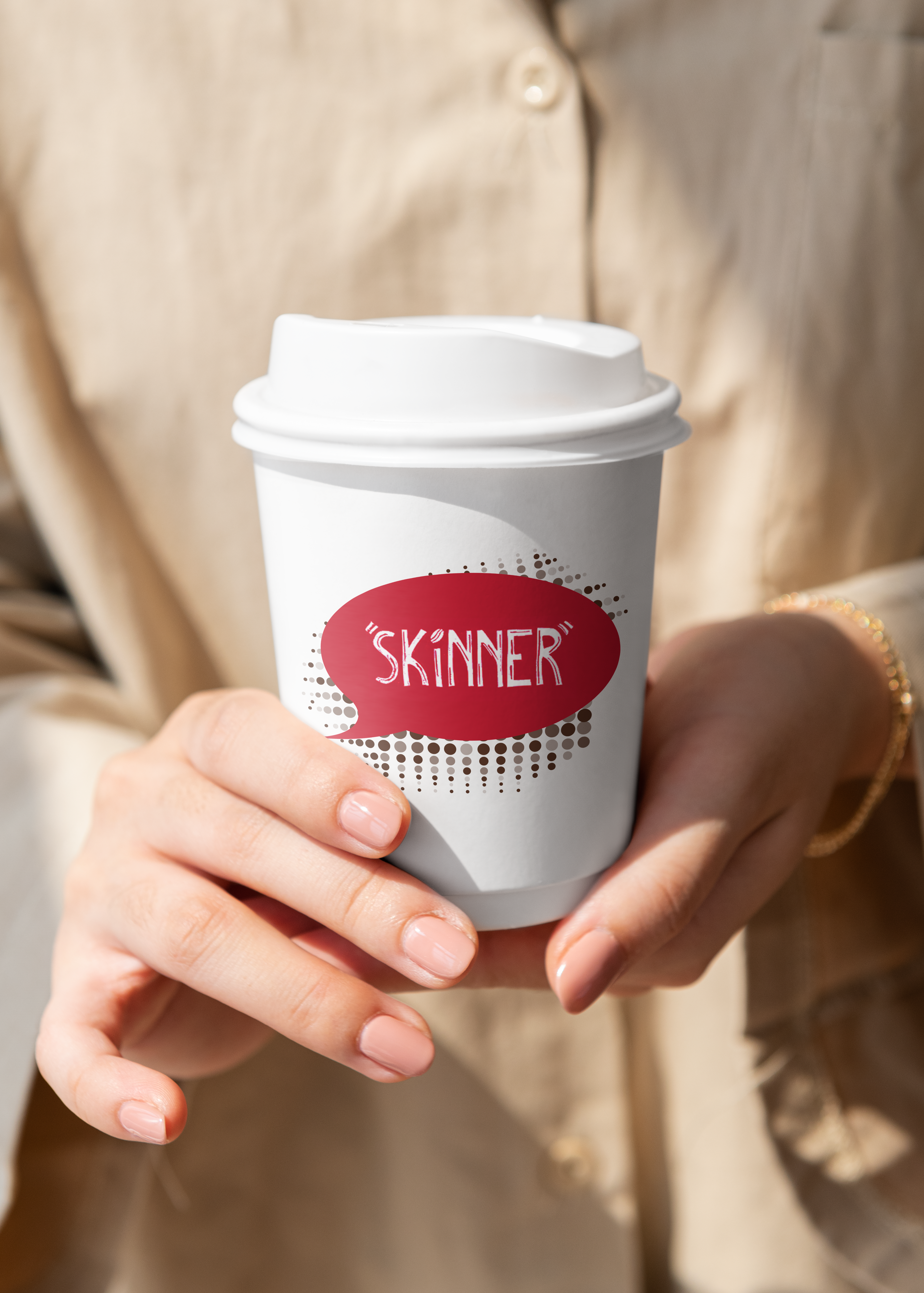
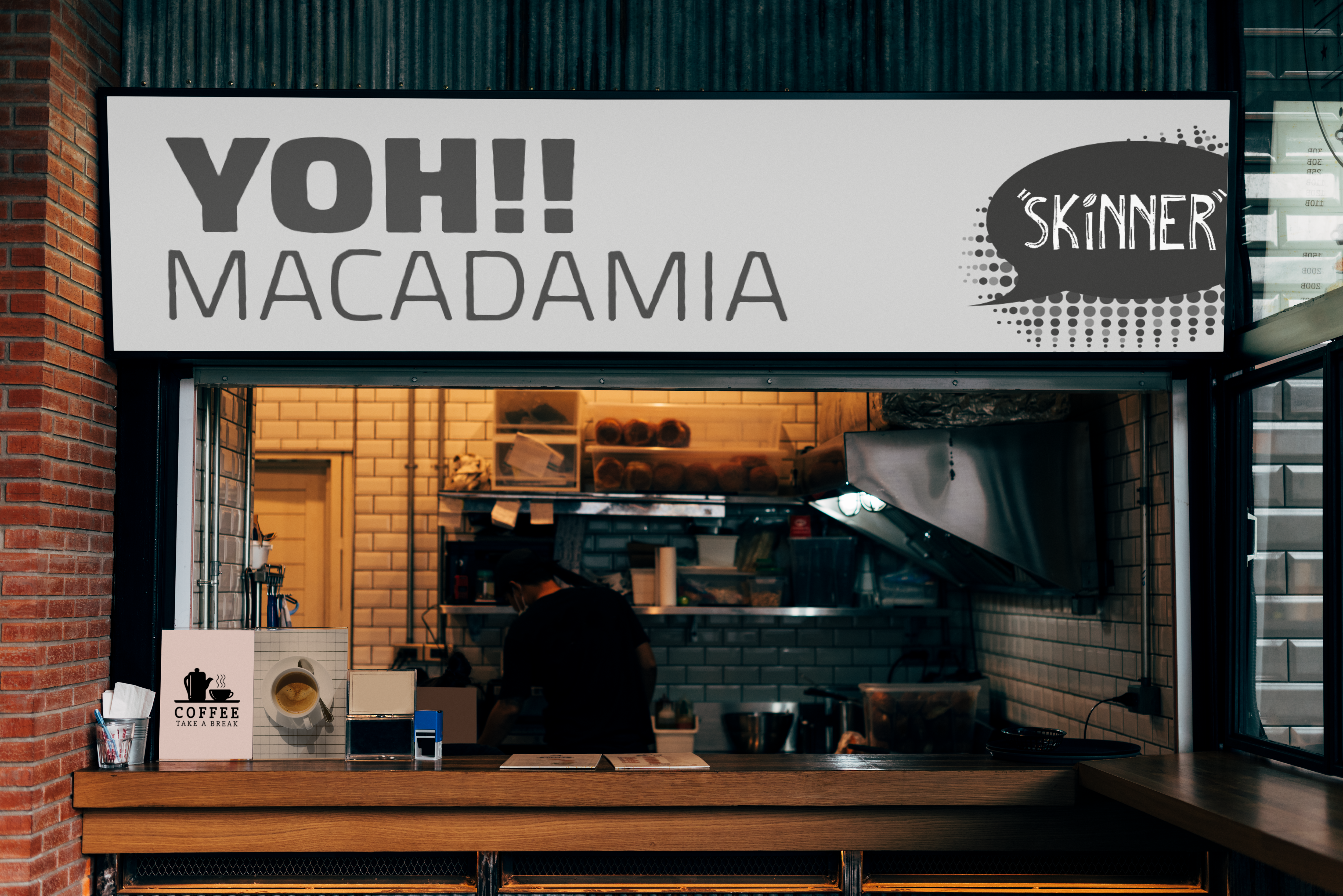
"Skinner"
Packaging Design & Brand Identity
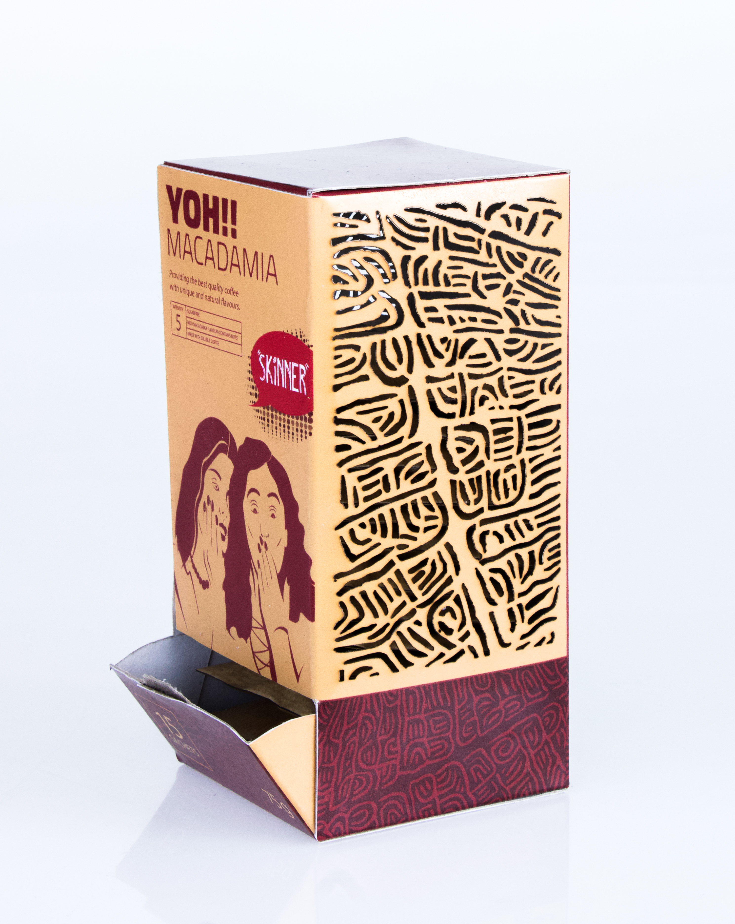
A playful coffee packaging concept inspired by South African slang, conversation and coffee culture, brought to life through custom illustration, lino-print patterns and sustainable packaging.



01 - The Brief
Create a distinctive coffee packaging concept that stands out on the shelf while making single-serve coffee feel more considered, engaging and sustainable.
02 - The Strategy
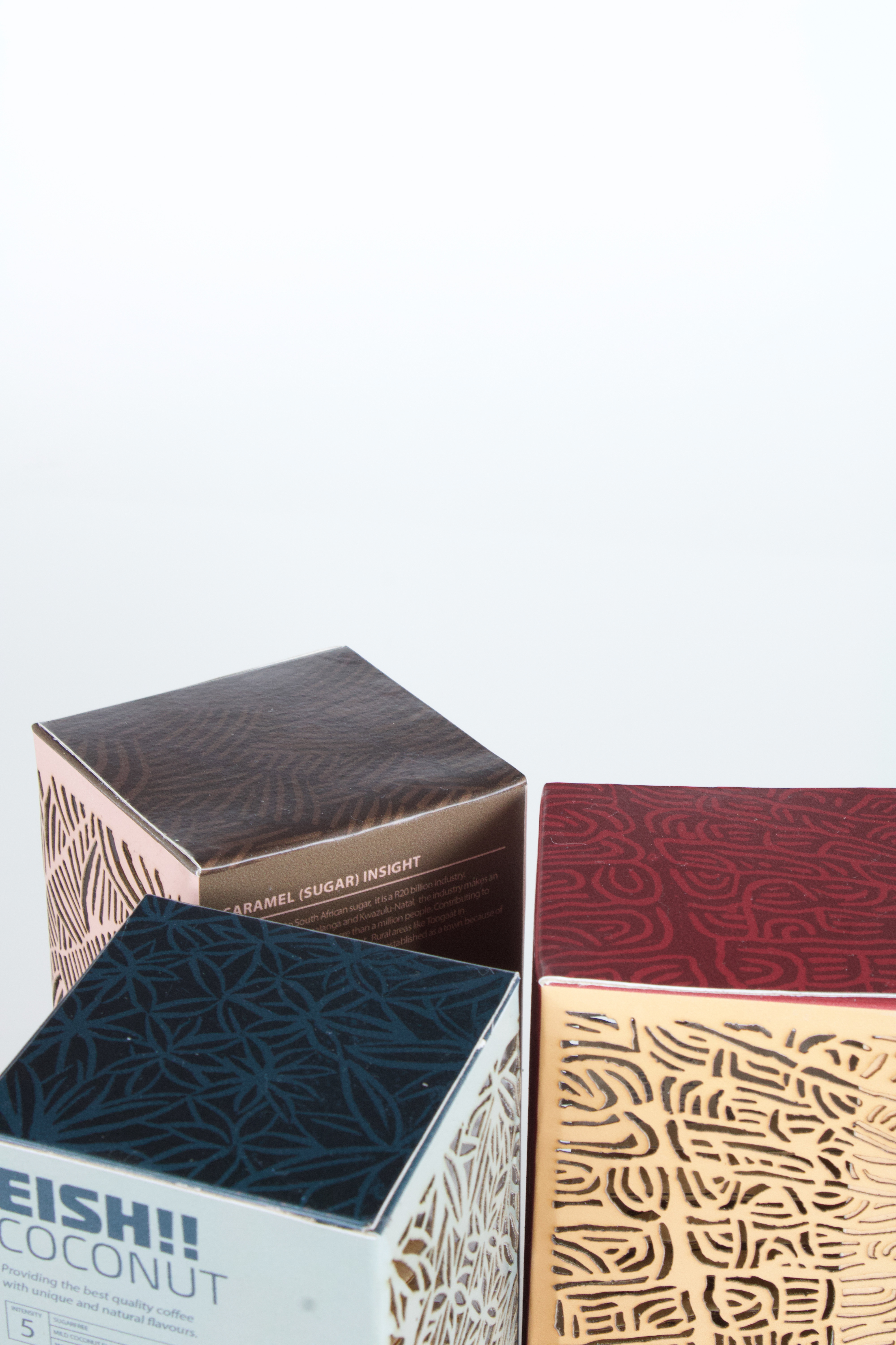
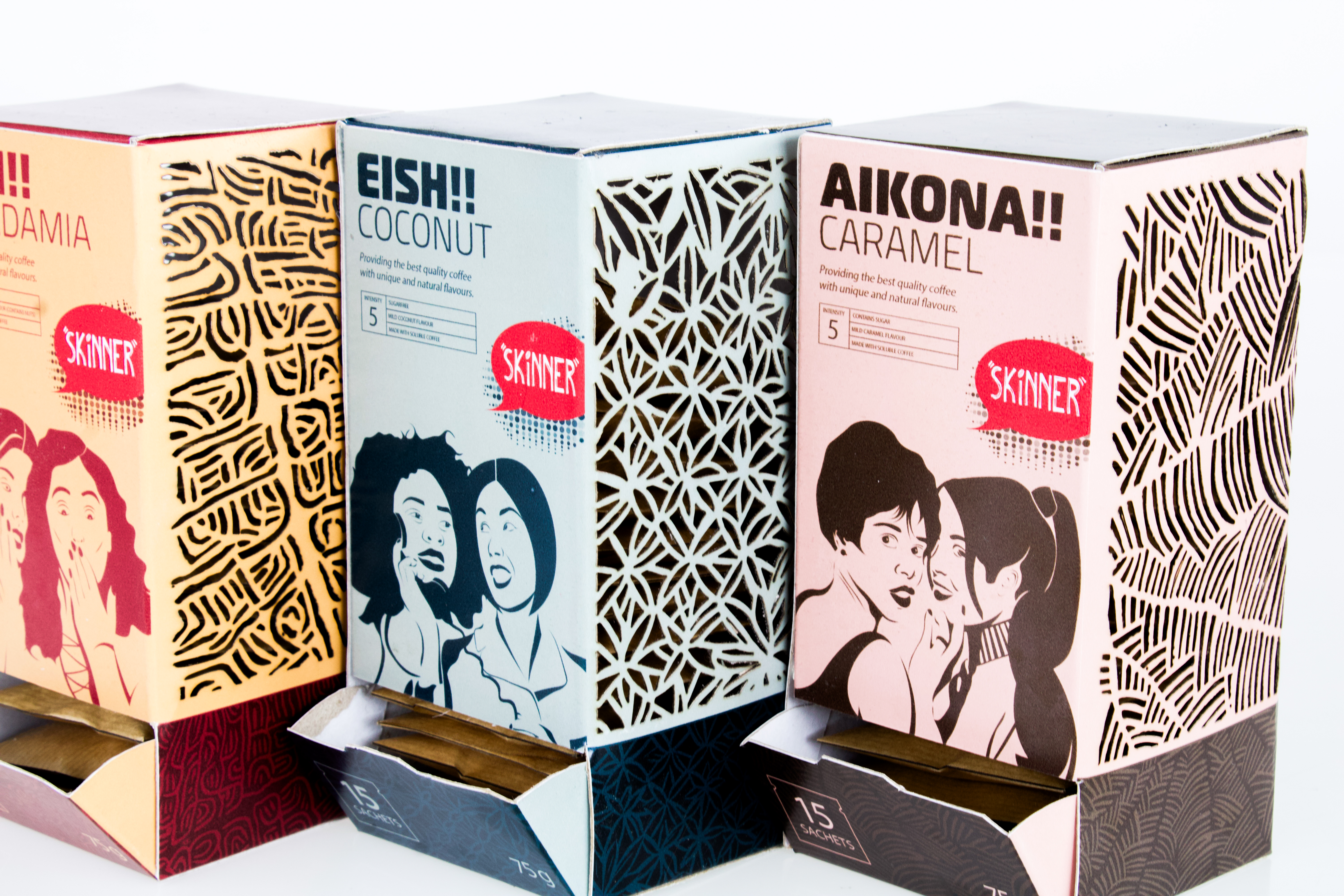
Skinner takes its name from South African slang for “gossip”, building the brand around the conversations that happen over a cup of coffee. South African language, playful humour and 1960s-inspired illustration were combined with custom lino-print patterns influenced by the plantations behind each flavour.
03 - The Deliverables
The project included the Skinner brand identity, three packaging variants, custom illustrations, lino-print patterns, coffee sachets, iconography, packaging dielines and physical pack designs. Each flavour was given its own colour palette and visual character while remaining part of one recognisable system.
04 - The Outcome
A playful and character-led packaging system that turns an everyday coffee sachet into a more memorable experience. The final range brings together humour, South African personality and functional packaging across three distinctive flavours, with recyclable paper-based materials considered as part of the concept.
bottom of page