top of page


Gated Wine Labels
Typography · Type Design · Packaging
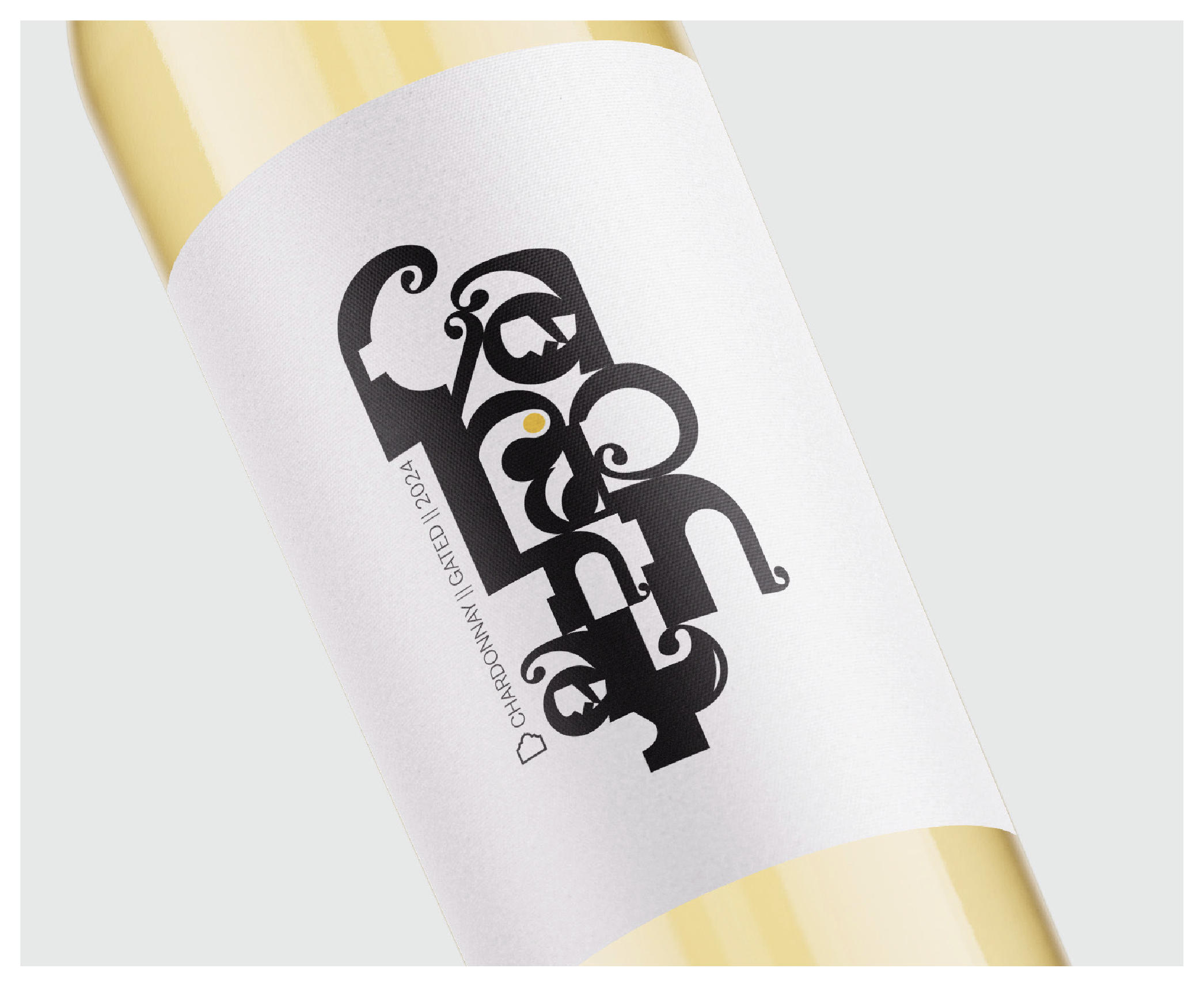
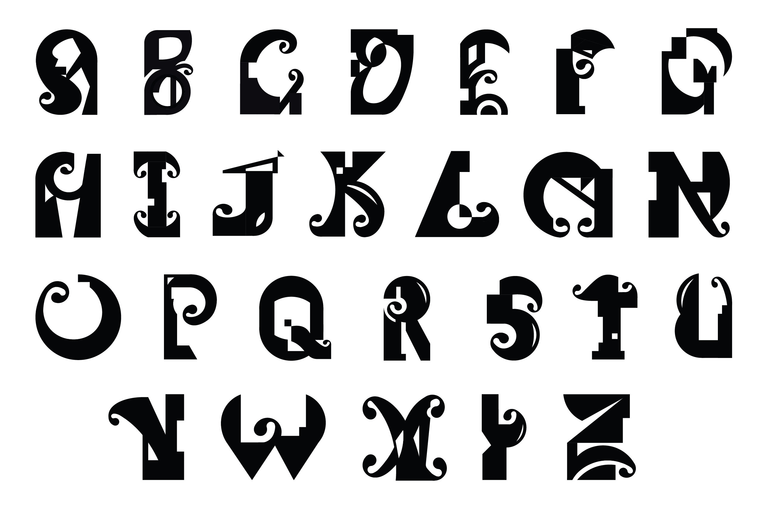
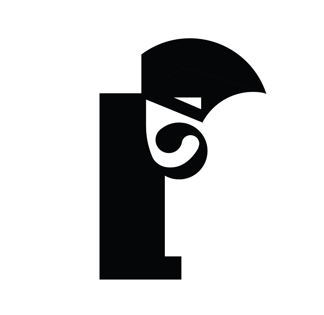
A custom typeface developed from gate-inspired geometry and applied to a wine bottle as a typographic label.




01 - The Brief
Create a custom typeface that represents personal growth and experience in Stellenbosch, South Africa, with the final typeface applied to a wine bottle.
02 - The Strategy
Translate the gates encountered throughout Stellenbosch into a visual language representing boundaries, growth and new possibilities. The typeface was constructed on a block-square grid and refined using circular geometry to create a balance between structure and movement.
03 - The Deliverables
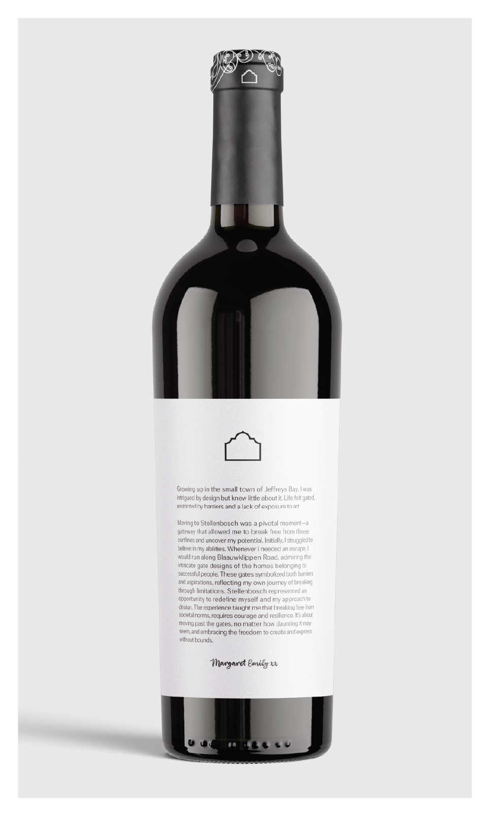
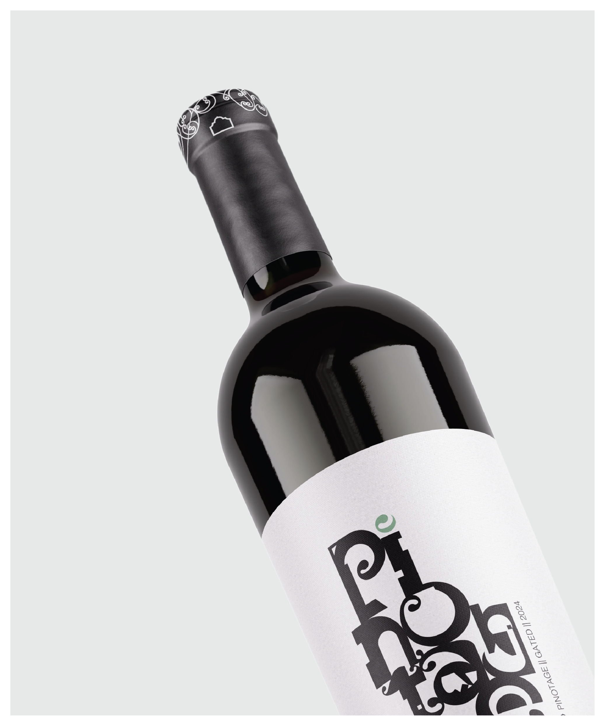
The project included the development of the custom typeface, typographic system and wine bottle label, with the letterforms becoming the central visual element of the packaging.
04 - The Outcome
A personal typographic identity that captures a journey of growth in Stellenbosch, transforming everyday architectural details into a distinctive typeface and wine packaging application.
bottom of page